
Reporting on Information Security Metrics That Matter to Executive Leadership
This piece provides information security teams with examples of metrics that matter to board members and executives along with guidance for presenting the data in a way that makes it easy for leadership to understand and act on.
We highlight the following meaningful information security metrics for teams to track for executive leadership:
- Results of third-party penetration tests
- Internal scans the information security team runs daily, weekly, and quarterly
- Phishing campaigns run by year and performance metrics (susceptibility, etc.)
- Plan of action and milestones (POA&M) metrics, including items per quarter, open items, etc.
- Security event statistics
Reporting Information Security Metrics to Leadership
Consider sticking to reporting on items you can control. You can’t control how many attacks you face, how much email you receive, etc. If it’s not something you can control and improve, crafting a compelling story becomes difficult. When reporting on security metrics that matter to executive leadership, it is important to keep your eye on the goal. What is it you are trying to help leadership see and understand, and what actions are you hoping to spur? Figure out the stories you want to tell and the changes you want made, and then align your graphics to support that.
Reporting on Penetration Test Results
With penetration tests, teams usually need to show what was found and what the current state of remediation is. The cleanest way to do that is with a dual bar chart. Show the number of original findings and the number of findings left to remediate. We suggest displaying it as a function of spend, so it’s clear how the cost of remediation affects the status (see Figure 1).
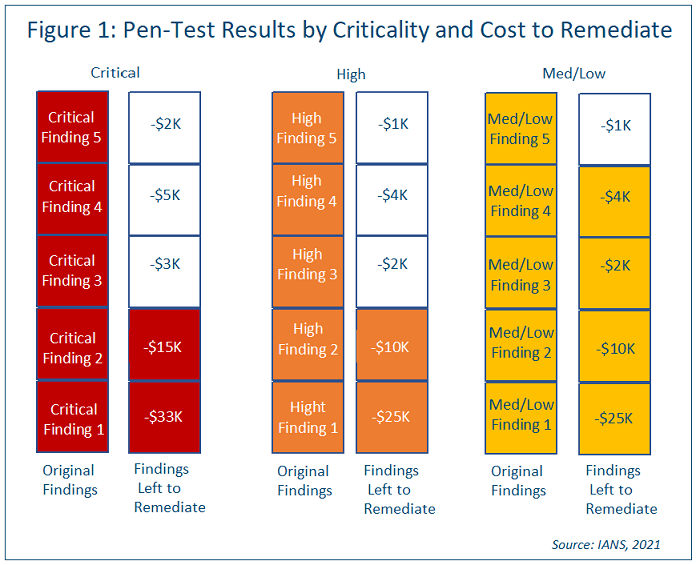
In the above penetration test result chart, it’s easy to see the pen test report results that cost most are still left to remediate, perhaps due to budget constraints. You could use a similar chart to show time required in hours, which would help tell a similar story for resource constraints.
Reporting on Internal Vulnerability Scans
Vulnerability scan metrics are usually presented in line charts. Let’s assume your organization has committed to a 15-day window to patch critical vulnerabilities, a 30-day window to patch highs and a 60-day window to patch mediums/lows. Consider using a red line to show the number of critical vulnerabilities that are still not patched 15 days out, an orange line to show the number of highs still not patched 30 days out and so on (see Figure 2).
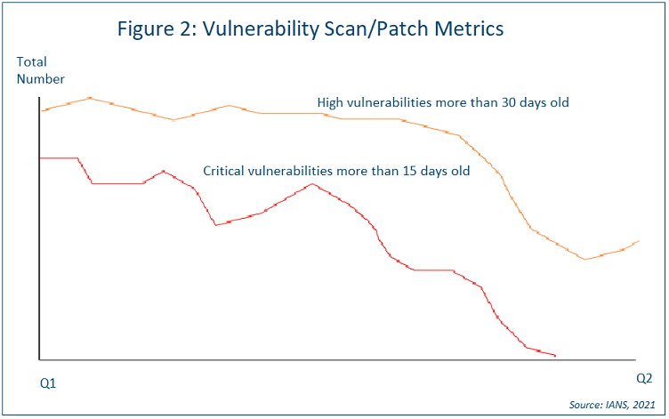
You might also want to present the number of vulnerabilities you don’t plan to address and why. This can be done in a way like the penetration test chart in Figure 1. Use one bar for criticals and cost numbers, whatever makes the most sense. List the projects and what you would need to do to fix them.
Reporting on Phishing Campaigns
When it comes to reporting on the effectiveness of your phishing program, a good story to consider conveying to leadership might be that as the number of people attending phishing training increases, the number of people clicking on phishing emails drops. And that can be shown in a bar chart (see Figure 3).
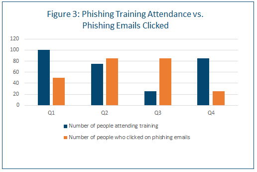
You might also want to show this by business unit. Another interesting phishing metric is to show the number of users who are trained vs. those who click on phishing emails by type of campaign, e.g., a delivery service (UPS/FedEx) scam, mergers and acquisitions (M&A), taxes, spear-phishing, etc.
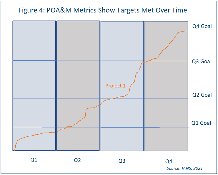
Reporting on POA&M Metrics
POA&M metrics can usually be shown most easily in a simple trend line. An option here is to show the targets by quarter and whether those targets are met over time. Since each project will have different plans of action, they should each have their own graphic for reporting (see Figure 4).
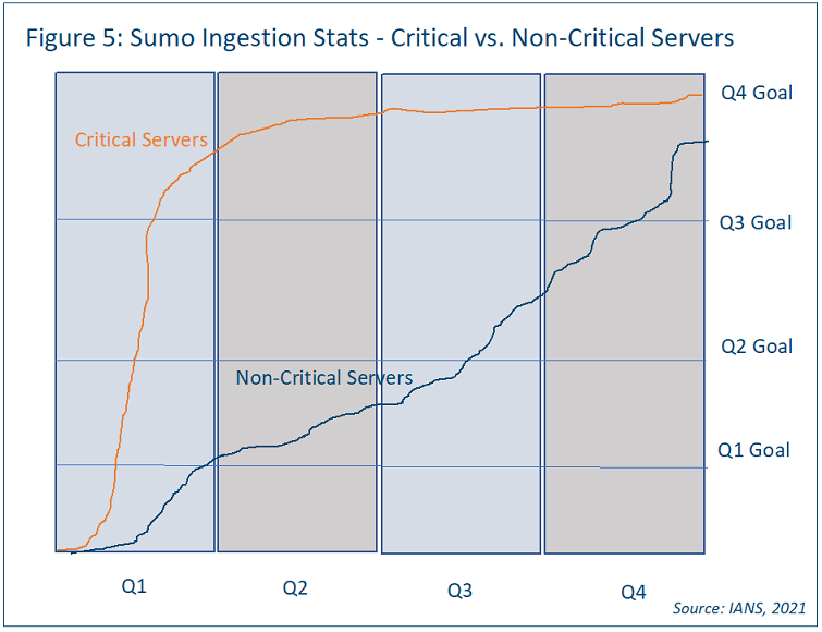
Reporting on Endpoint & SIEM Ingestion Statistics
In terms of ingestion into your SIEM, consider creating a graphic similar to the POA&M example, with a similar trend line showing non-critical servers vs. critical servers (see the Sumo Logic example in Figure 5).
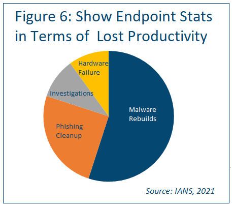
As for endpoint security metrics, consider using a pie chart as most individuals can read them easily, so there’s a good case to be made for usability.
Consider showing lost productivity by hours, using categories like malware rebuilds, phishing cleanup, investigation, and hardware failure (see Figure 6).
Reporting on these by business unit is also a possibility, perhaps showing Business Unit 3 is losing the most time to malware rebuilds. If malware rebuilds are taking an increasing amount of time and contributing to increasing amounts of lost productivity, a case can be made for better blocking technology. The idea is to report on the pain points and show a complete picture of the situation.
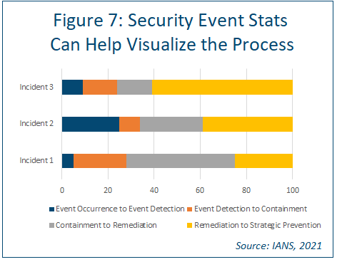
Reporting on Security Events
The idea here is to help executive leadership visualize the process. Consider using a stacked bar chart to present metrics on event occurrence, detection, containment, remediation, and strategic prevention for a variety of different events (see Figure 7).
Tips for Presenting Information Security Metrics to Executives
When presenting metrics to the C-suite and other executive leaders, it’s important to be clear and keep your story front and center. To be successful:
- Focus on what’s important. Try to avoid drowning the audience in data. Ensure each graphic helps add to the story you want to tell. If it doesn’t, don’t use it.
- Try to avoid telling stories you can’t execute on. Figure out what you have capacity to work on for next four quarters and show graphics for that. Of course, if your executive leadership ask for certain specifics, report on those, but don’t bring in a truckload of data you can’t act on.
RELATED CONTENT: How Information Security Leaders Can Engage the Board Effectively
Although reasonable efforts will be made to ensure the completeness and accuracy of the information contained in our blog posts, no liability can be accepted by IANS or our Faculty members for the results of any actions taken by individuals or firms in
connection with such information, opinions, or advice.