
Dashboards that show concrete, trending and actionable data offer a useful way to tell your security story. This piece explains the key ingredients of an effective executive-level dashboard and offers tips for building one that tells a story with succinct, meaningful data.
DOWNLOAD: Create Metrics to Use for Budgeting and Decision-Making
What is the Best InfoSec Dashboard?
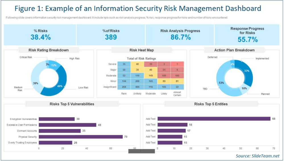
This question could be asked by any security team in any industry. Dashboards are a reporting vehicle often used at the executive level. The right dashboards provide a lot of information using little space (see Figure 1).
It is important to keep in mind that each piece of data in a dashboard should work to convey a message. What story are you trying to communicate to your execs? Some common stories to consider include:
- Security posture improvement over time
- Increase or decrease in security risks
- Setting the stage for a budget ask
Dashboards can be and often are multiple pages. Don’t get caught up squeezing everything down to an unreadable level by trying to fit everything on one page.
DOWNLOAD: Create Incident Response Metrics Worth Reporting
InfoSec Dashboard Content and Layout
Lead off with a short executive summary. Use a paragraph to summarize the security metrics that matter to the business and set the narrative. Keep in mind this is sometimes the only thing an executive will have time to look at on the dashboard.
A sample executive summary might look like this:
In Q2, information security observed an uptick in the meantime to respond (MTTR) to security incidents. This is due to the departure of two analysts and one incident responder. These positions have been posted and we anticipate filling them in Q3. No critical vulnerabilities were identified in our environment and others identified were remediated within the SLAs outlined in policy. We were able to work with the business to close a key risk of ABC, which reduced our exposure by X%.
Provide an overview of the risks facing the company. This can include:
- Trending of vulnerabilities over time
- Number of incidents handled, broken down by severity
- Security risks that exceed SLAs or service-level objectives
- Progress or measurement against the company’s preferred framework, e.g., the NIST Cybersecurity Framework
Choosing which risks or key performance indicators to highlight is dependent on the story you are telling. A good rule of thumb is to include anything that is a critical or high risk, issues you’ve been asked about from the board previously, any “newsworthy items” and security metrics for the C-Suite that help support your story.
Keep in mind your dashboards and reporting are likely to change over time, as your leadership becomes savvier and more comfortable with the topic, and as the security landscape continues to change. Be prepared to revisit and update the content and layout.
DOWNLOAD: Tips for Creating Effective Executive Dashboards
Executive Dashboards – Key Data Components
Great executive-level dashboards all have some key ingredients in common:
- Consistency: Ensure the data you are reporting is consistent over reporting periods and you are collecting data in the same way over similar time periods, every time. If there is an anomaly, be sure to mention that. Consistency ensures apples-to-apples comparison, which makes trending easier to discern.
- A focus on trends: Trends describe the story over time. Are SLAs consistently missed? Does this mean more people are needed or is automation the way to go? Being able to demonstrate consistent data over time helps your story evolve.
- Concrete, understandable and actionable data: One way to ensure your data is actionable is to understand the difference between operational metrics and executive metrics. Operational metrics focus on the number of alerts received or the volume of logs ingested by the SIEM. This is important to your operational teams to ensure their infrastructure is healthy and operating as expected, but it doesn’t help an executive much.
A non-exhaustive list of good executive-level examples includes:
- Capability maturity and trending over time, including a forecast of maturity: This can lend credence to the initiatives the department has going on.
- Incident response metrics, such as mean time to detect, MTTR, and detection and alert effectiveness, i.e., how effective are the deployed controls?
- Summary of the risk registry and level of risk present: This can look like a heat map or a bar chart.
READ: How to Identify and Develop Staff for Senior Infosec Roles
Tips for Effective Executive Dashboards
Executive dashboards are a powerful and effective communication tool to tell a story. To ensure your dashboards are successful:
- Determine what story you are telling, and what story metrics your executives need to hear. Then ensure you use the right metrics to support that story.
- Don’t be afraid to ask your top execs what they want to hear about: But don’t be surprised if they don’t know. Use this as an opportunity for education and be prepared to provide examples of what you could report on.
Take our CISO Comp and Budget Survey in less than 10 minutes and receive career-defining data and other valuable insights and data sets.
Security staff professionals can take our 2025 Cybersecurity Staff Compensation and Career Benchmark Survey.
Although reasonable efforts will be made to ensure the completeness and accuracy of the information contained in our blog posts, no liability can be accepted by IANS or our Faculty members for the results of any actions taken by individuals or firms in connection with such information, opinions, or advice.